WILSON ST. DUPLEXES
ANCHORAGE, ALASKA
Categories: Two Family, Anchorage, Spenard, CIHA, urban infill redevelopment
Total area, buildings: 5,280 sq. ft. [new]
Total area, site: 22,650 sq. ft.
Cook Inlet Housing Authority is a vast organization with multiple initiatives proceeding simultaneously and a statewide reach. In Anchorage, they have been steadily redeveloping part of the Spenard neighborhood centered at the corner of W. 36th Avenue and Spenard Road. Their main offices are also located at this intersection. They have built or are building several multiplex apartment buildings in the vicinity.
The redevelopment effort is profoundly changing the character of the area. The neighborhood streets used to look neglected, stagnant and forlorn. And also charming and rustic. There were small houses and cabins built in the 1940s and ‘50s interspersed with trailer parks, strip retail, small multiplexes – all in various states of repair – and the occasional vacant parcel. Not a lot different than 50 years ago except the housing stock is not in as good a condition now.
The small residential division of CIHA has contracted with FRamE for design of a few projects in this same redevelopment zone, including two duplexes on Breezewood Dr. and one duplex on Harrison St. [2017] and a fourplex on Oregon Dr. [2018]. A project on McCain Loop [two duplexes and a triplex] commenced construction in 2021 and will be finished in 2022.
In between Oregon and McCain in sequence, a project for two duplexes on Wilson St. was undertaken in 2020 and completed in Fall 2021. The site, a corner lot formerly occupied by a small frame house and detached garage/shed was a good size at 22,650 square feet, allowing for ample yard space even after the substantial amount of paved driveway and parking required for the courtyard/single-driveway arrangement – necessitated by the desire to not locate a driveway on Chugach Way since it is part of a neighborhood collector road – and both Chugach Way and Wilson St. are narrow right of ways compared to the norm.
The desire was for one building to be a mirror reflection of the other, arranged about a center court with parking. Normally we at FRamE do not believe in this “cookie cutter” approach to house design since every site and situation is different and what works well in one location may be deficient across the street or down the block. How often we have observed existing houses and apartment buildings and thought, this site had potential that has not been not realized by this building, for one or several reasons – maybe most of the living area windows don’t look at the best views or are positioned on the north or east sides where they don’t bring in much natural light. In some cases they are disrespectful of the close neighbors by blocking views and/or sunlight to adjacent sites.
At the Wilson St. site the mirrored building approach seemed like it could work. Each building has a 3-BR, 2-BA, two-story unit in the front, closer to Wilson St. and a 1-BR, 1-BA, one-story unit adjoined and behind. The buildings are L-shaped, with the 1-BR units closer to each other at the west end of the parking court and the 3-BR units further apart at the north and south ends.
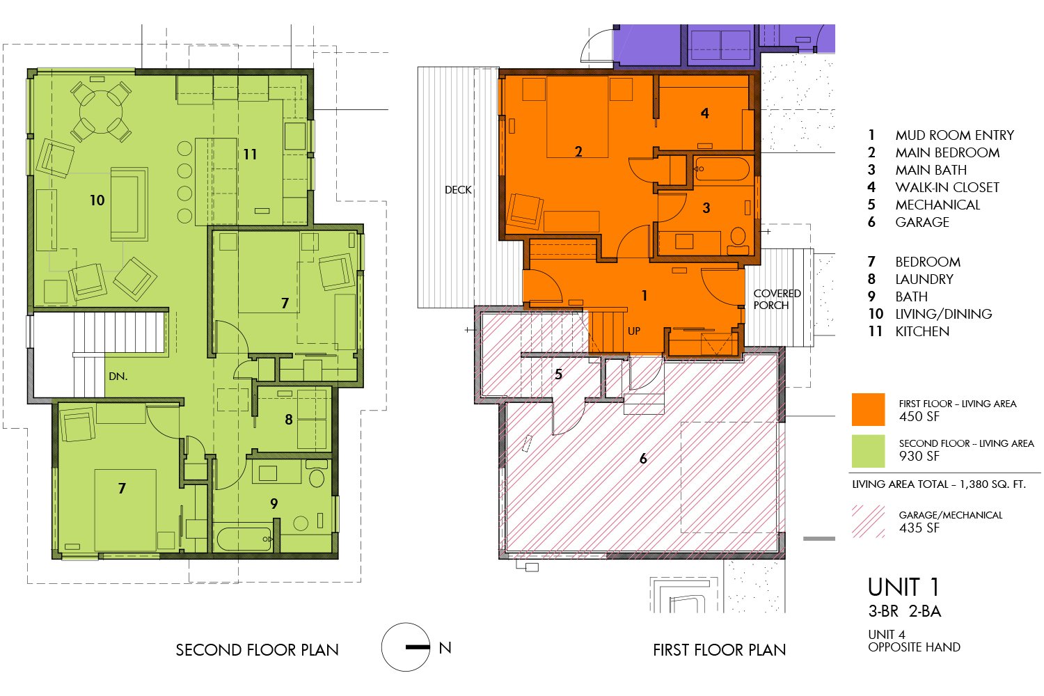
The 3-BR units are oriented with the long dimension east-west, with the second floor living-dining-kitchen area on the west end where there are groupings of corner windows that offer comparatively serene vistas for the busy midtown location, looking over an adjacent large property that adjoins the headwaters of Fish Creek. The two secondary bedrooms and bath are on the east end of the second floor, and the first floor consists of a wide single-car garage, a Mud Room entry that extends fully from front to back and leads to a deck on the back side, and a Main Bedroom suite with bedroom, attached bath and walk-in closet.
The 1-BR units are closer to square proportions in plan. One is accessible and the floor plan is slightly rearranged to provide a large bathroom and all of the required maneuvering clearances, fixtures and access ways.
The two buildings are staggered 10 ft from each other, helpful so that one can look out the window and past the building opposite instead of right at it.
Because of the site characteristics and orientation, the back and sides of the building are as visible as the front, so a strong effort was made to make all four sides have facade modulations [recesses and pop-outs] and/or two or three siding types and playful arrangements of windows and roof planes.
As usual, detailed attention was paid to windows and what is seen and not seen looking out. At the bedrooms closest to Wilson St. most of the windows are high on the wall and the ceiling is sloped – thus, focus is on the treetops and distant mountains and not on the street and traffic. High, horizontal strip windows are used throughout in order to maintain privacy while still bringing daylight to the interiors and making the residents feel connected to the neighborhood.
This project fits in with the other FRamE/CIHA collaborations – stylistically similar enough to appear to be part of the same family; different enough to stand out. An appearance that is 2020 modern and also hints at the mid-century modern design era of the 1940s, ‘50s and ‘60s; plus a slight dose of whimsy.
Hopefully at all these sites we’ve been able to provide upgrades compared to the norm in the local rental market, improving the lives of the tenants via a thoughtful and comprehensive, site-specific design approach.
Site Plan showing single driveway off Wilson St. and arrangement of buildings, sidewalks and landscaping. Chugach Way is a neighborhood collector road that is sometimes fairly busy. CIHA has repaved, straightened and added curbs, gutters and sidewalk to this portion of Chugach Way as part of work on adjacent properties.
Second floor, Unit 1. Unit 4, opposite hand.
Unit 2. Unit 3, similar/opposite.
Framing underway, Oct. 2020. Unit 1, north side.
Unit 2 looking west — the tree buffer at the west edge of the site provides a rustic, private setting in an urban area.
Bedroom at second floor, SE corner of unit 1 demonstrates how window placement improves the experience by highlighting views of trees while de-emphasizing the street. Can’t do anything about the power lines.
Framing complete, Nov. 2020. All of the roofs are 3:12 pitch — this peculiar view using a 9mm wide angle lens is distorted and makes the forms appear more extreme than the are in real life.
Further along in the process — siding and interior finish work underway, April 2021. Looking east from the property next door. Units 3 and 4 on the left; 1 and 2 on the right.
West side of Unit 2.
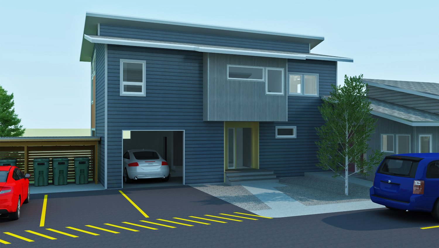
Units 3 and 4, 3-D render by FRamE.
Finished unit 4, south side.
Looking east from Unit 3 entry. Unit 4 porch on the left. Wilson St. and neighborhood context.
Unit 1, north side. 3-D render by FRamE.
Unit 2 with the chartreuse door.


