FRamE Hall of Fame: Reyner Banham

British-born architectural critic/historian Reyner Banham [1922-88] is perhaps the greatest interpreter of the city of Los Angeles -- how it happened and what makes it tick.  His writings about the place, and especially his short film Reyner Banham Loves Los Angeles [1972] deconstruct the city as no one else has done before or since.

I love L.A. almost as much as Banham, and find it an incredible garden of earthly delights with a rich, unexpected array of resources.  It's also completely out of control and over the top.  I visited in simpler times -- 1976, 1982 and 1985 and not since.  It's not everybody's cup of tea.  [Mike Davis's book, City of Quartz offers a useful perspective of modern-day L.A. as it has developed in the years after Banham's passing.]

In the early 1930s quite a few show business actors, producers, writers and crewpersons relocated to Los Angeles from New York, as Hollywood became the headquarters for motion picture production.  In the book Grocuho, Chico, Harpo and Sometimes Zeppo, a Marx Brothers bio by Joe Adamson, the author recounts a cross-country trip by S.J. Perelman and Will Johnstone, comedy sketch writers for the Marxes:

"Now we cut back to Hollywood, where Perelman, thoroughly appalled all the way across the country by his prolific partner [Johnstone insisted on doing watercolors of every vista that came into view, besides getting three weeks of comic strips finished in three days, all with a hand shaken by a rocky roadbed and three crocks of illegal applejack], now stepped off the train to be appalled anew, by what he later described as a land of "Moorish confectionaries, viscid malted milks, avocado salads, frosted papayas, sneak previews... studio technicians, old ladies studying Bahaism, bit players, chippies, upraised voices extolling the virtues of various faith healers or laxatives... the city of dreadful day... Bridgeport with palms... a metropolis made up of innumerable Midwestern hamlets... an unalloyed horror...  a hayseed's idea of the Big Apple... everything about that city's murders had the two-dimensional quality of American life... viewed in full sunlight, its tawdriness is unspeakable; in the torrential downpour of the rainy season, as we first saw it, it inspired anguish... After a few days I could have sworn that our faces began to take on the hue of Kodachromes, and even the dog, an animal used to bizarre surroundings, developed a strange, off-register look, as if he were badly printed in overlapping colors."

Perelman didn't get it.  Banham did.  In England and elsewhere Banham used to cut a sporting figure [tall man with a neat suit and bushy beard] riding a folding bicycle.  He learned how to drive later in life when living in L.A. so he could understand the area better.  In his 1971 book Los Angeles: the Architecture of Four Ecologies he breaks down the area's experience by geographical overlays, and in so doing deepens our understanding of its unique cross-cultural mashup and novel aspects.

Also really enjoyed his 1982 book Scenes in America Deserta.  This one is out of print and hard to find, but worth it.  Banham uses his investigative and analytical triangulation to cast a wider net over the wide open spaces of the American West.

There is also a 2003 biography of Banham called Reyner Banham: Historian of the Immediate Future, by Nigel Whiteley.  It's a lengthy volume with lots of photos and graphics collected, and ultimately runs a little flat and isn't nearly as interesting as its subject.

Banham has the qualities I like the most in writers and documentary producers: an infectious enthusiasm and strong sense of humor and the absurd.



FRamE Hall of Fame: Robert Liberty

What a joy it was to catch an hour long presentation by Robert Liberty today at Anchorage's City Hall. Anchorage Citizens Coalition brought him to town and titled his talk, Anchorage Can Get It Right. Indeed, Anchorage has been conflicted about growth and densification for awhile now. At this moment it's clear that the physical landscape has changed, and approaches to development and redevelopment practiced in the past are inadequate to enhance present and future quality of life. 

While growth shock is a reality, opinions differ on the causes and best fixes. Just as when accomplished architects and artists visit Alaska on the Alaska Design Forum lecture circuit, or via another organization or venue, a Robert Liberty presentation is a chance to benefit from somebody else's experience [in this case, dealing with redevelopment strategies in a city that's now larger and denser but grew out of similar beginnings]. Portland is 60 years older than Anchorage, and about that many years ahead of us in their thinking and experimentation.

Of course, there's always an undercurrent [or sometimes, more prominent display] of skepticism that says, "This is Anchorage, not Portland; and it can't happen here". Liberty addressed that at the beginning, showing examples of infill redevelopment in cold climate, smaller cities. Yes, it seems that in many cities smaller than Anchorage there are more ambitious plans taking shape. He challenged the notion that we have nothing to learn by Outsiders. And then proceeded to show us some of what has been implemented in Portland without drawing any conclusions, or making any suggestions for Anchorage.

One important distinction he drew was in overall approach: fund outcomes, not projects. He used examples of two controversial projects there: proposed reconstruction of the I-5 bridge over the Columbia River connecting Portland with Vancouver, WA; and a proposal for a western freeway bypass. [Strikes one as so similar to large project proposals here: Knik Arm Crossing and Highway to Highway.] Why not, Liberty asked expand consideration of alternatives to include any that would achieve the same goals? [First, clearly establishing what the goals are.] This is almost opposite of what the typical process is in Southcentral Alaska -- specific projects are planned, and engineering firms and contractors are tasked with writing reports that justify the predetermined outcomes -- often with limited consideration of related consequences.

There's nothing like a couple of powerful aerial photos to help make your points. Liberty showed one of a typical US urban periphery, with a multi-lane freeway passing by marginally used industrial land, not well-connected between surface destinations and not hospitable or desirable. And next to it, about the same filled with a traditional city grid originating in the pre-automobile age. He noted that, in a compact connected grid, even with all the roadways only having two lanes there is a greater vehicle capacity compared with the pattern shown in the first aerial, because there are many alternate routes available.

Another fascinating example was from San Diego, where a road diet project converted a former five lane, two way arterial to two lanes with limited turning, and roundabouts instead of traffic lights at intersections. Where the old setup moved 20,000 vehicles per day, the new one still manages 18,000. With fewer lanes and fewer stops, the traffic moves slower but more continuously. Rather than turning left, one advances to the next roundabout and drives around it, making a 180 and then a right turn to destination. All that was an amazing achievement by itself -- the best part is that with the traffic calmed, the street has now become a desirable place to live and work -- and attracts residential development that never would have occurred along the former roadway.

Liberty wrapped up his talk with accessory dwelling units [a subject near and dear to us at FRamE]. ADUs, he said are an easy way to increase density that doesn't change the current appearance of neighborhoods very much. Anchorage has only had an ADU ordinance for a little over ten years, and they are still not allowed in R-1 zones [where they could possibly have the most positive potential impact]. They haven't really caught on yet, but there's so much potential as a way to leverage property value and diversify the experience of a neighborhood.

Anchorage talked a pretty good game in the late '90s when developing its Comprehensive City Plan, Anchorage 2020. The main focus was enhancing neighborhoods and developing Town Centers [i.e., dense neighborhood commercial centers with mixed use buildings]. In the years following, accomplishments have been disappointing and in many ways we are heading in the wrong direction. Liberty showed how a more honest accounting of goals and parameters would benefit us all, not only the few benefiting from continuation of present trends.

Residential stairs 101

Stairs can be a tough task for seasoned designers and are an aspect many homeowners have difficulty understanding. This post will attempt to establish some basic parameters and items to consider when planning a new house or an addition/remodel.

Stairs in commercial/public buildings have more rigorous rules than stairs in houses. In a house, the dimensional requirements for handrails, riser height and tread depth are relaxed somewhat to allow the stair to occupy less space while remaining safe to navigate and climb.

Architectural Record Magazine has for decades now selected its ten best houses on the planet in the annual Record Houses issue. Reading through these in the '80s and '90s, one was awestruck at how many of the winning designs featured stairs that appeared to not comply, for one, two or multiple noted reasons. In the most extreme example, a stair connecting a main and upper level consisted solely of 2" x 11" x 3 ft monolithic slab treads protruding from a side wall, without risers and with no railings of any sort. One wondered how on earth such stairs passed inspection and how their designers could sleep without picturing a two year old teetering at the upper landing area above a 10 or 12 foot drop-off. In recent years the trend has fallen off a bit, and the stairs in Record Houses generally appear safer.  

Cultural differences might account for these stairs? One can notice, in photos of places outside the U.S. that it's pretty common that guardrails have much greater than 4" spaces, and they may be lower than we'd require them to be, or sometimes omitted altogether. One photo in an architectural magazine showed a group of people sitting on a rooftop deck in Amsterdam, 2-1/2 stories above the sidewalk. There was built-in seating, a fire pit and hot tub; and there were thin posts at about 6 ft spacing/about 2 ft inboard of the edge, but no guardrail or anything else to keep people from falling off. Part of growing up is learning to recognize and manage risk, and ideas differ on the best way to ingrain that in children. We might be too overprotective in some ways?

Protection for people of all ages can be enhanced by effective placement of stairs. Exterior stairs are magnificent in many locations. Outside of Los Angeles there are streets built in canyons where the houses are elevated well above the street but relatively close to it, and exterior stairs [tile on concrete steps with solid stucco guardrails, or something functionally similar] are a nice welcoming gesture and functional way to reach the front door from the street. In Southcentral Alaska, and anyplace else where there's winter weather for months at a time exterior stairs should be avoided wherever possible. The grandest exterior stair in Anchorage, at the Loussac Library was finally closed and demolished this year, after 30 years of struggling with its maintenance and safety issues.

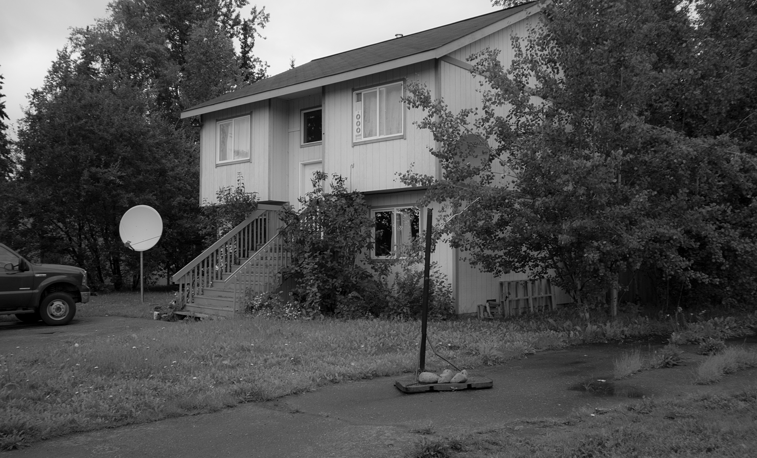
In the neighborhood where FRamE is located there are four or five builder spec houses built in the early 2000s that are similar to 1970s split-levels, but instead of the lower floor being a half-down basement, these houses have two full stories above a crawl space. The front entrance is still spotted at a mid-level between floors -- so, even though doors could have been placed anywhere on the First Floor and would come out 18 inches above grade, there are none -- and to get into the First Floor, one has to first mount an exterior stair [with 9 or 10 steps, not covered by a roof] and then descend half a flight inside the house down into the lower level. Ridiculous, and never should have been built that way in the first place. These houses would be easy to remodel. In other cases it's much more challenging.

The house was built 15 years ago and the stairs have not aged well.  There ought to be a way to enter the ground level directly.

The house was built 15 years ago and the stairs have not aged well.  There ought to be a way to enter the ground level directly.


Note that, even at ground level if there is a crawl space, and the floor framing is platformed on the top of the foundation walls there will still be 18 inches or so, minimum from the floor of the house down to grade. Plan to leave room for the porch and a couple of steps, and provide for a roof cover over them.  In larger houses, or when conditions allow it can be effective for an area inside the front door to be a couple of steps lower than the surrounding floor area, and especially if the front door is oriented facing a prevailing wind direction. In the winter the depressed entry floor can function as a cold sink and the rest of the house will be less affected by cold air rushing in when people are coming and going. [It really works!]

Now that the entry placement is addressed and exterior stairs eliminated, let's consider how stairs fit inside the house. The common mistake of homeowners and novice designers is to not consider the stairs early in the thought process. Stairs connect to hallways and spill out into larger areas and are part of the circulation path through the house. The smaller the house, the more it benefits by a tight circulation pattern that minimizes the need to pass through intervening rooms on the way to others. Thus, it often makes sense that the stair is centrally located and not pushed to one end or the other. Whether or not the stair is right inside the entry is often an issue of preference. If you're entering at a floor level and not at a split entry, the stairs don't need to be in close proximity, and it might be better to tuck them in elsewhere. 

In some circumstances a stair can be a feature, and include widened landings, lots of glass and other design features that take in territorial views or other special aspects of the site/setting. If the house is large enough, and depending on site characteristics two stairs can be placed instead of one. It's always nice to have options, and it can make the space feel more expansive and open than it would otherwise be, and even prepare for a future conversion such as adding a rental apartment within the house.

Cross-section of Forever House [one of FRamE Featured Projects on this site].  Drawing shows stairs [dashed in, beyond] and their placement to connect the interlocking half levels of the house.  A variation of switchback stair type.

Cross-section of Forever House [one of FRamE Featured Projects on this site].  Drawing shows stairs [dashed in, beyond] and their placement to connect the interlocking half levels of the house.  A variation of switchback stair type.

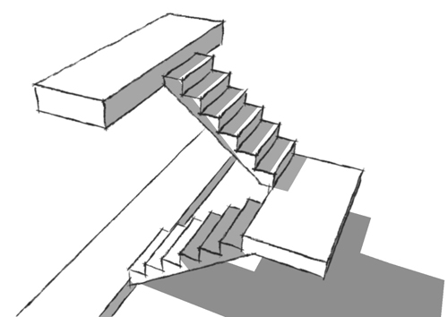
The stair type that is used most of the time is a switchback stair. It is the least dangerous, and best reconciliation of utility and compactness. It is typically installed so its upper and lower landings are in a convening hallway, thus subtracting three feet or more of length. The mid-level [switchback] landing is usually the full width of both runs [including center wall, if used] combined, making it easy to move beds and large furniture items [compared to other stair types such as L-shaped, winding, spiral]. Since there's two runs it's not possible to fall down a full flight, as it would be on a straight single run. The switchback stair is usually placed between two rooms, with the mid-landing against an exterior wall. It can be placed in the corner [two sides on an exterior wall] -- if this is the case, better to have the upper run of stairs outboard, so the exterior wall height is lessened in case it is a structural issue [wind load resistance].

Typical switchback stair, with hallways doubling as landings at top and bottom.

Typical switchback stair, with hallways doubling as landings at top and bottom.

If there's a drawback to a switchback stair, it is what to do with the leftover space underneath. Most often, it becomes a closet, and not a very useful one since the tallest part must be left unencumbered for access to the lower areas at the back.  It might be possible for the upper run to protrude into adjacent room/space and not be enclosed?

The tri-level is a suburban tract house variation that was popular in the 1960s and not after that.  The main criticism of it is that it divides the interior into three distinct areas that don't communicate with each other well.  FRamE is looking for it to make a comeback, in this new era where people are looking for effective designs for short term rentals. It seems perfect for that -- Owner's suite above rental suites, with the mid-level [Entry, Living-Dining-Kitchen-yard connection] shared. [And both the upper and mid-levels can easily have high vaulted ceilings.] The stairs on a tri-level are similar to switchback stairs, and although in a tri-level the two runs don't need to be next to each other, they most often are for circulation efficiency.

Stairs in a tri-level.  Basement [about three feet below grade] on left, crawl space below mid-level on right.  The area left over under the stairs isn't as much of an issue.

Stairs in a tri-level.  Basement [about three feet below grade] on left, crawl space below mid-level on right.  The area left over under the stairs isn't as much of an issue.

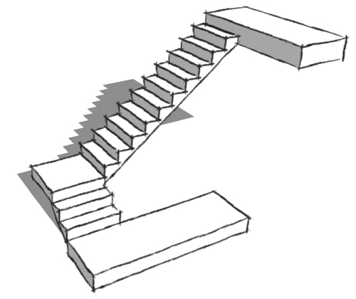
Another stair type frequently seen is the L-shape.  Sometimes the mid-landing is at or near the halfway point; more often it is close to the bottom.  This arrangement will feel better if there are at least two steps [two treads; three risers] on the lower run rather than just one. Will just need to make sure that required 6'-8" vertical clearance is met and coordinate floor opening/framing above, depending on floor to floor height.  Another consideration is how the L-stair fits into the floor plan.  As an example, if the stair run is 44-1/2" wide [clear; 45-1/2" framing dimension] the two 10" deep treads on the lower run will flush out with a hallway wall enclosing a 60" deep room [perfect size for bath, laundry, closets].  If you're tucking a bathroom under stairs, don't push it too far -- in at least one instance, a tub/shower under the stairs -- long part of tub parallel to stair run; shower valve and controls on the taller side -- worked out well in every detail except the shower rod and curtain were cut off by the angled ceiling under the descending stair. 

Preferred L-shape stair, with minimum three risers on lower run.  Consideration should also be given to railing and side wall configuration in order to allow largest furniture, built-ins, appliances, etc. to be moved in and out of the upper lev…

Preferred L-shape stair, with minimum three risers on lower run.  Consideration should also be given to railing and side wall configuration in order to allow largest furniture, built-ins, appliances, etc. to be moved in and out of the upper level.

There's a lot of demand these days for spaces in houses to be multi-functional.  And there are a lot of ideas out there for stairs in this regard.  Some of them are good ideas.  A switchback stair with a widened landing, a bench and a large window [particularly one that frames an interesting view] can provide a great little away space while spilling daylight into the stair and adjacent interior.  It does this without any compromise to safety and utility.  Other ideas are more questionable.  It doesn't seem like a good idea for a step to double as a drawer.  Maybe on a sailboat?  But in a house, sooner or later the drawer will be open when coming down the stairs in the middle of the night -- and stepping into the drawer rather than the next stair will cause an injury.  It's not worth it.  Let the stairs be stairs, and find some other way to provide extra storage.

Oooh, that smell!

The office stinks!  I can't be the only one that's noticed the distinct smell of an architect's office.  Can I describe it?  There's definitely graphite in the mix.  And paper.  And maybe ink?  Stain and paint.  Toxic off-gassing from material samples?  Wood and concrete?  Strong coffee, certainly.

Perhaps it is an airborne combustion of all of the above mixed with tears of desperation?  [That wouldn't be far-fetched.]  However it is generated in the first place, it is remarkably persistent and transferable.  It must move from the old office to the new one in the horsehair dust brushes and rolls of old plans, and fans out upon arrival.

I was probably a month or two old when I made my first visit to my dad's office, and by the time I could walk and talk the scent was familiar to me.  In those days, there was also ammonia and cigarette smoke in the mix.

There's a lot less of the smell in modern offices.  At Bezek Durst Seiser's office, the smell was 90 percent gone from the main studio, but it was strong in the bathrooms when I first started working there in 2005 [until the rooms were remodeled].  At a building downtown near the Federal Building, I noticed the smell is still there [strong in the shared corridor and elevator] even though the architect's office has moved out.

I was kind of tickled the other day when I opened the front door of my house and the architect's office smell was spilling out into the living area from the offices of FRamE!  Whoa!

A while back I noticed a news item that somebody was developing a GMO garlic that was scentless.  Heresy!  Why would you deprive yourself of that aroma [even if it isn't your favorite?].  What I didn't realize until recently [another case of, you don't know what you have 'til it's gone] is the garlic experiments were a symptom of a larger conspiracy to eliminate a major part of experience of an interior environment -- one that architects used to control.